Iconography
🔹 Needed for NSW Government Branding
Icons illustrate actions, communicate status, indicate an interaction and draw attention to important information.
Usage
The NSW Design System uses Material design icons (filled versions) for an easily implementable and consistent user experience.
Icons can be added to components or paired with text. Avoid having icons as standalone as they may be interpreted differently by different users. It is important to ensure where an icon is used it matches the intended action.
Accessibility tip
Use sr-only class to hide text that are intended for screen readers to give more context on an icon. This can also be applied with form labels, interactive buttons, and navigational links. View the global alert component to see it in action.
Text Icons
Add an icon next to text to support the action.
Button Icons
Add an icon into a button to support the action.
Component Icons
Add an icon to a component to represent interactivity or communicate a status.
Your application has been received
Thank you for submitting your interest. We will be in contact within 5 business days.
Styling
Colour
Icons that are clickable should use Brand Dark to remain consistent with text link styling. If icon is on a background that changes the colour of the text (for example a button) the icon should take on the same colour as the text.
Icons used to represent a state should use the appropriate colour, for example an icon used in a success notification should use Success Green.
Icon rotation
Application
Sizing
The NSW Design System displays icons at four sizes (20px, 24px, 30px, 36px) depending on their type, use and screen size:
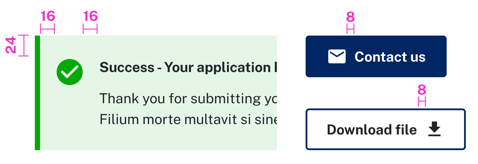
Spacing
Ensure you allocate the right amount of space around an icon to allow for legibility and touch. Wherever possible, use an 8 pixel spacing grid to create a consistent visual structure.
Accessibility
Do:
- Wrap icons within their interactive component
- Specify if an icon is decorative and informative by assigning the appropriate property. (Add code example)
- Use descriptive and meaningful titles for informative icons
Designing
Icons used to build base components are included in the UI Kit. Base colour ranges are available and can be changed using the Variants panel in Figma. If you require additional icons, you can download them from Material design icons and import where required.
Material Design Icon Padding
Maintain the default internal padding in each icon file. This padding is tied to the icon when implemented in development, therefore when designing you should accommodate for this padding.
Creating SVGs
The majority of design software allows you to create an SVG file by selecting this format when exporting.
Tips for creating SVGs:
- Flatten and outline all elements
- Do not use masks
- Ensure white colour is intentionally white and transparent is intentionally transparent
Benefits of using SVGs
SVGs are scalable vector graphics made up of points, lines and shapes which can easily be adapted in size making them an advantageous choice for responsive design. Other benefits of using SVG format over other raster formats (for example JPEG, GIF and PNG) include:
- Ability to scale and graphic to any size without losing quality
- Smaller file sizes means your page will load faster
- Easily editable strokes and colours through CSS